Did you know you can manipulate your blog without logging in to your back end? Chrome Developer Tools allows you to inspect the coding behind your blog to find errors, preview potential changes and test out any new ideas. Developer Tools is a free function of all Chrome browsers, and has some simple uses for your blog. It’s a great way to feel like a developer, without learning endless code.
We’re covering the some functions that are easy to use, and won’t leave your head swimming in code. If you’d like to get more technical, head to Google’s full rundown.
Opening Developer Tools
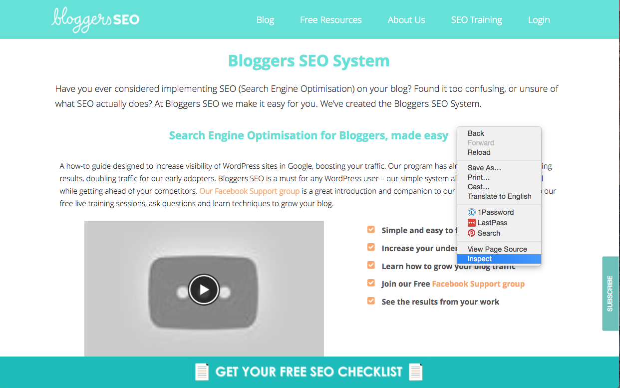
We’re giving our other favourite tools a run for their money and saying this might be one of the easiest to get running. All you have to do is open your chrome browser, visit any site, and right click. From the drop-down, select ‘Inspect’. This will open a section of code at the bottom of your browser, and create a ‘preview’ area where you can manipulate your site. You can also browse through your site, to see how each page appears.
Creating Mock-Ups
Ever wondered what your blog might look like in a different colour, or if the text on that button could do with an update? Developer Tools gives you a fun, non-permanent way to experiment with your website. The best part is, you can’t mess anything up – no permanently deleting code, crashing your site or CTRL+Z failing you. It’s all in your browser, leaving you to temporarily modify as you wish.
If you’re familiar with coding, the bottom toolbar will be easy to navigate. If not, that’s okay! We’ll go through basic functions and easy ways to play with your blog’s coding without drowning you in numbers.
First, let’s give your blog a little facelift – how about a new colour scheme? You can easily preview how new colours will look without permanently altering your site. Right-click on the section you’d like to change – you could scroll through the code in the bottom toolbar and find the section you’re after, but clicking it instead is a lot easier.
We’ve chosen our menu/nav. You’ll see the code in the right-hand column change, and a small coloured square appears – this is the colour of that section currently. To change the colour, you can easily click the Hex Code (# followed by six digits) and enter the specific colour (maybe one you’ve already chosen), or you can click the coloured square that opens up a spectrum slider where you can scroll through EVERY colour possible! You can ALSO drag your mouse across your site, where it will pick up the colour of the area below – really handy if you want to replicate colours, but don’t know the code!
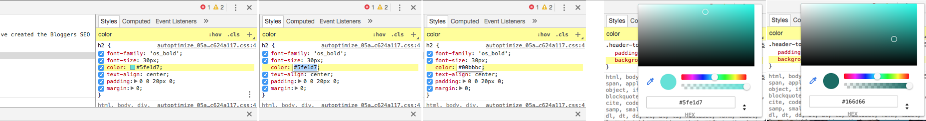
If your colour section isn’t appearing at the top, you can save scrolling and search by simply typing ‘color’ (not ‘colour’) into the ‘Filter’ box in the right-hand column.
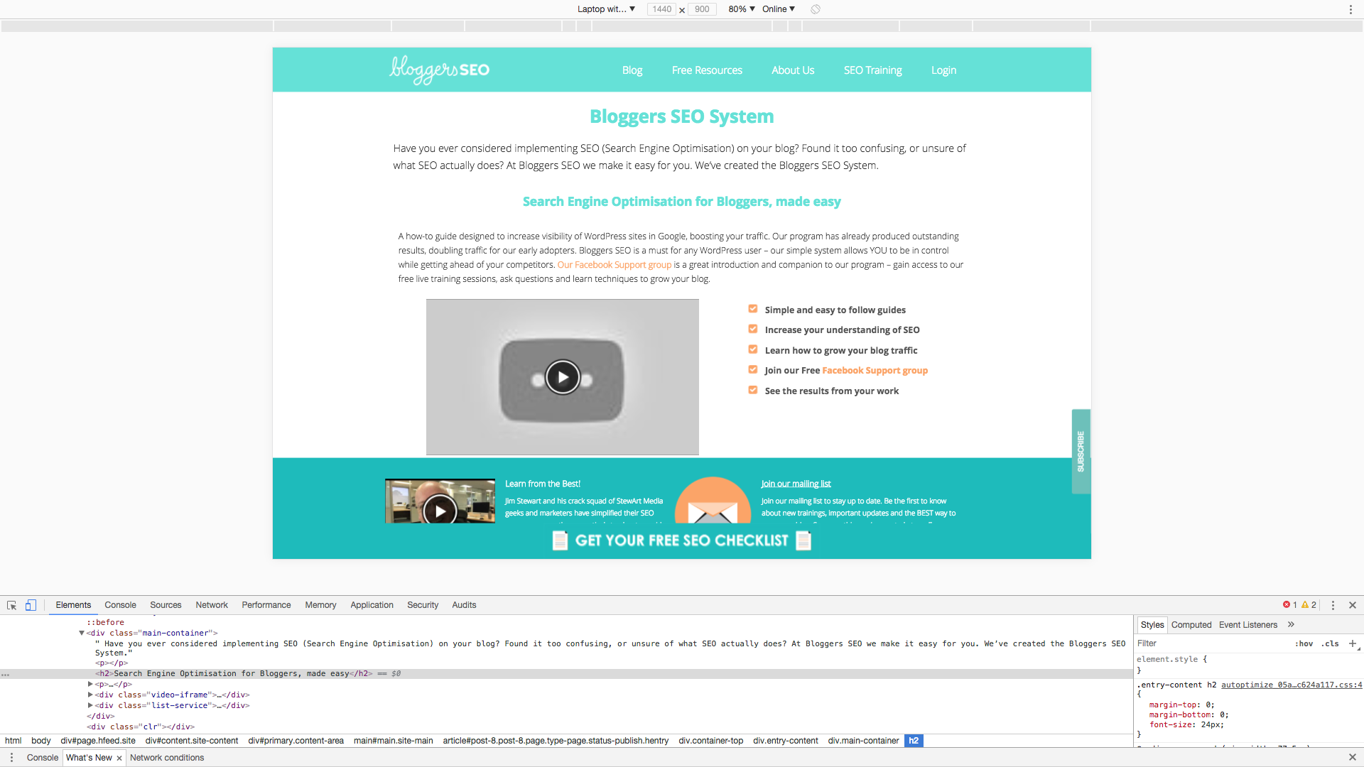
Depending on how your theme is laid out, your blog is divided into different sections, even if you can’t always see them. If you’d like to edit a particular piece of text, an image or a section, simply right click and select ‘Inspect’ on that area – you can do this once the inspect window is already open and makes it easy to shift between sections visually, rather than scrolling through code.
This time, we want to change how our heading appears. After highlighting the text and inspecting, scroll through the right-hand column. You’ll find words like ‘font-size’ ‘margin’ ‘padding’ and ‘color’ – remember, you can search for these in the Filter box! See how the changes made to the code change the appearance:
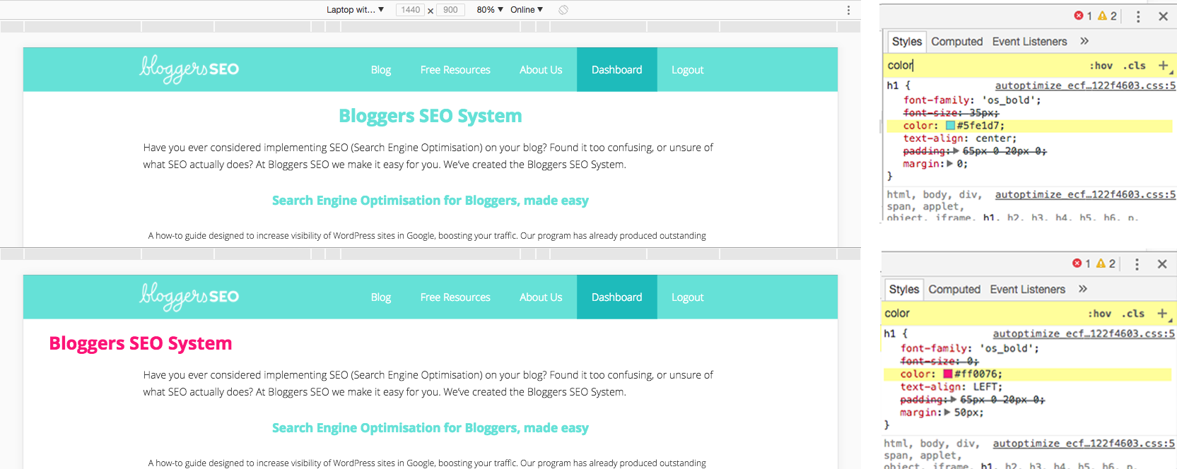
You can also preview text changes – highlight a piece of text (like a heading), and inspect. In the code section, you’ll notice a single line highlighted blue – inside this, you’ll see the same text you’ve highlighted. Simply double click this text, and type in your new text. Hit enter, and it will appear on your screen!
Narrow in on Your Images
Oversized images are the most common blog killer. When you upload an image to your blog, it has a pixel dimension – this translates to a physical size. If you upload a 1500px wide image to go into a 750px wide container (say your post image header), the image will display at the right size for that spot. BUT, your user will have to download the full-sized 1500px wide image. That leaves them downloading twice the amount of information they actually need to and gets worse as the gap between the real image size and the size it displays at widens.
One image here or there won’t spell disaster, but given that blogging is very visual medium, I’m betting you have several images on every page and post. Every millisecond your reader spends downloading unnecessary information is doing you harm. If your site takes too long, your readers will leave – and Google will drop your precious rankings.
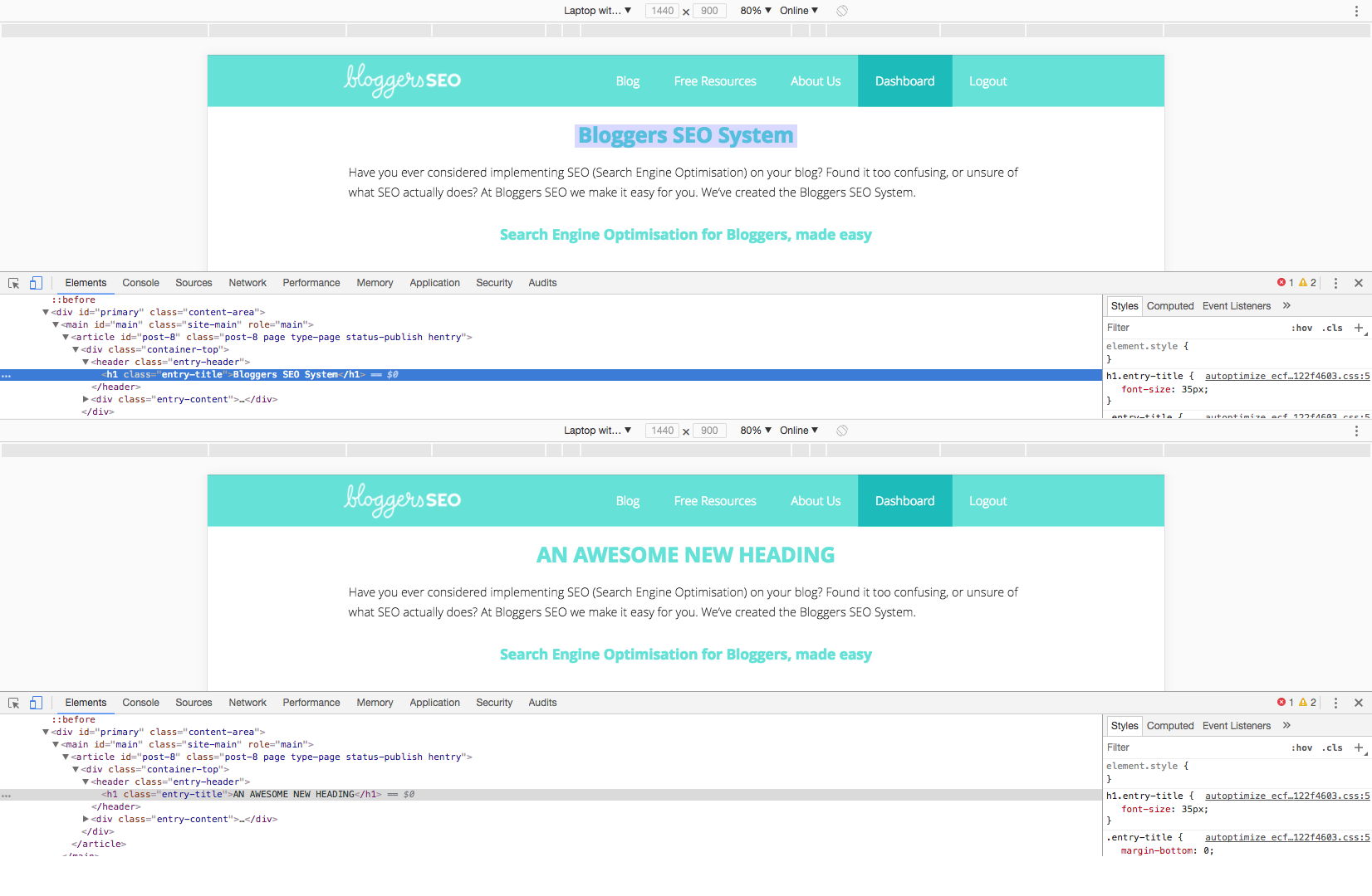
You can use Chrome Developer Tools to find out how big image containers are across your site, AND how big those images actually are – giving you an easy way to find out which ones need fixing, and their new size! Once you’ve opened developer tools, highlight any image on your site and click ‘Inspect’. Then, you’ll notice a small flag above the image – this is the dimensions of the container.
The first number is the width. Now you’ve got the largest size of the container, you’ll need to check if your image is actually that size, or larger! Oversized images mean readers have to download unnecessary information, slowing down your blog!
You’ll see the image details highlighted in blue in the code section. Look for ‘width=”X” in the code. The ‘X’ will be replaced with a number – and it should be the same as the width in the flag above the image. You can also hover over the Image URL in the highlighted section to see these numbers side by side. If they’re not the same, get resizing!
Test Your Responsiveness
Have you ever really considered just how often you use a mobile device to access the web? Mobile usage across the word is rapidly taking over as the preferred method, and Google knows it. Mobile First Indexing will be here before we know it – where the mobile version of your site will be indexed over the desktop version. It’s bad news for anyone with poorly set up sites, but luckily now most themes and CMS’ create a responsive site. Take a look at your blog on desktop and mobile – do you notice anything different? Your mobile version might have a vertical menu, and elements like text will appear in a single vertical column.
Testing the responsiveness of your site, AND how it looks on different devices means you can ensure you’re delivering the best experience to all your readers, regardless of how they’re accessing your site – you can use Google Analytics to see real data for your blog.
Developer Tools allows you to test your responsive site design to any potential screen size, as well as a range of popular and benchmark devices – how does your blog look on an iPhone 8, compared to an iPad Pro? Dev. Tools will show you!
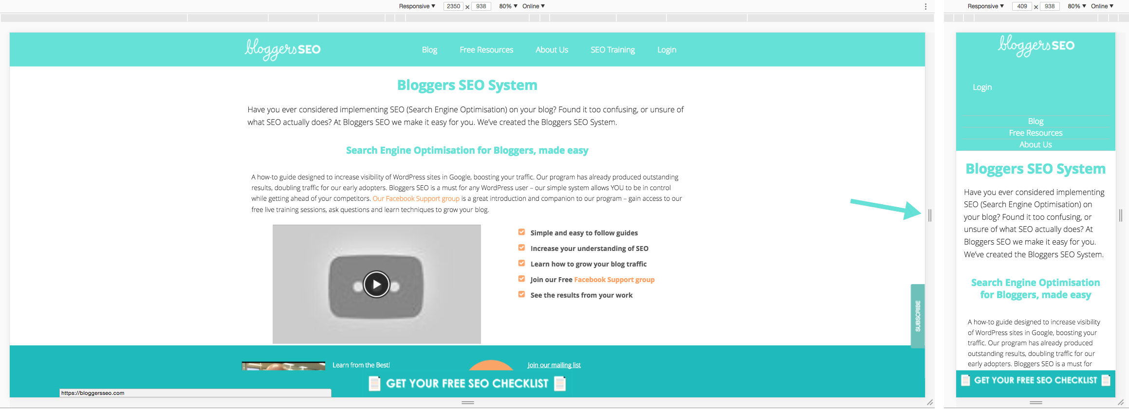
Once in the Developer Tools screen, you’ll notice a small grey bar at the top – just below your browser toolbar. Here, you’ll have a drop-down with a list of devices, and ‘Responsive’. Next to this is the dimensions of that particular device for easy reference. Clicking on the black arrow will open a drop-down of available device presets.
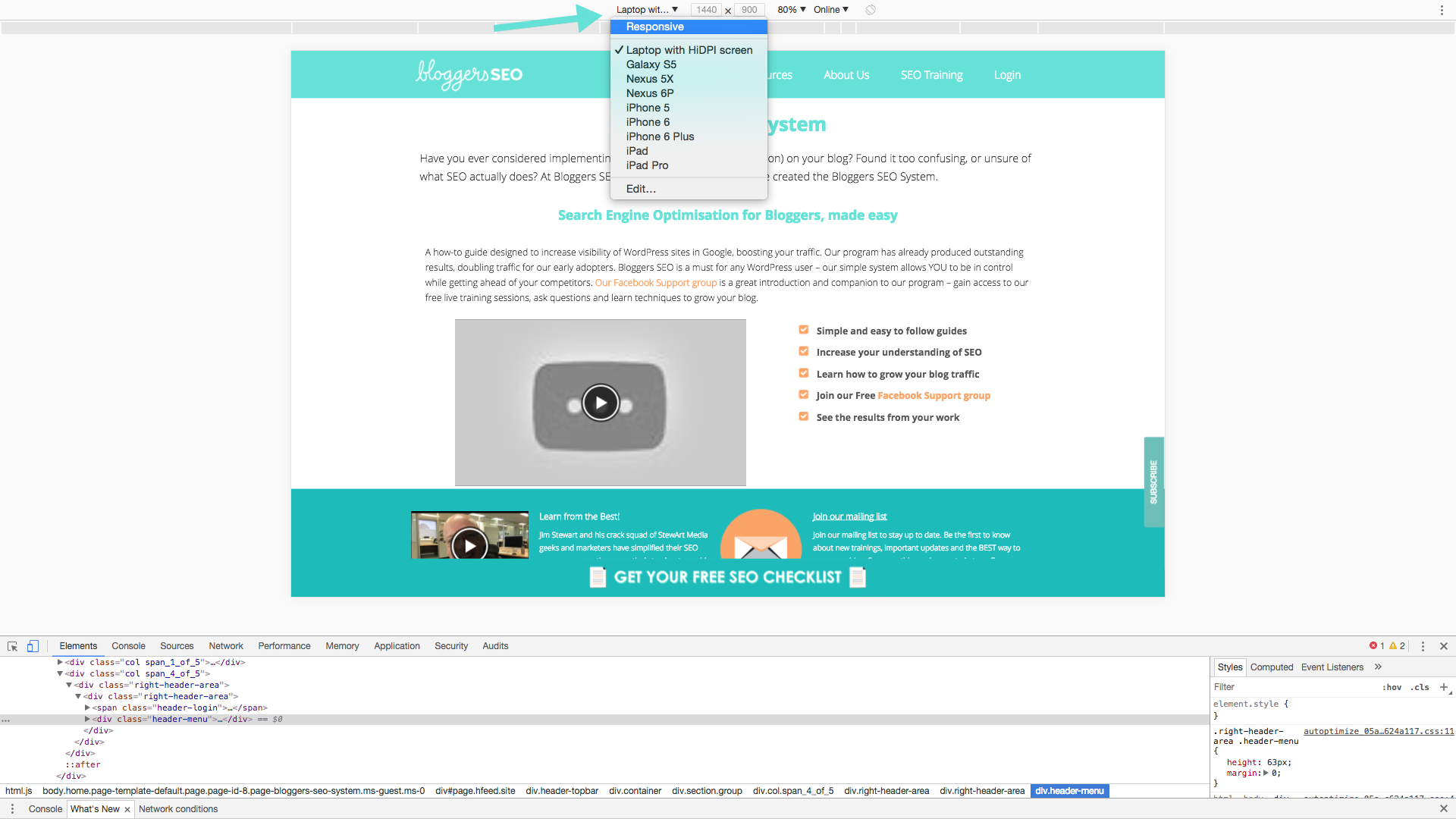 First off, let’s compare your site on Desktop VS Mobile. Select ‘Laptop with HiDPI’ from the list, then ‘iPhone 6’. You can choose any mobile device you’d like, as long as you’re familiar with it for this exercise.
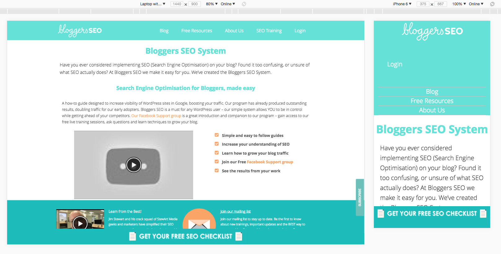
You might also find it handy to take a screenshot of each option or open them in separate windows so you can compare and identify any faults site by site.
‘Responsive’ allows you to manually adjust the width of the screen simulation by either entering a pixel dimension in the top bar or dragging the grey bar on the right of the preview.
Found something with Developer Tools and not quite sure how to fix it? Expert advice is right this way!